Making our north star funnel a reality
Background
In the aftermath of the pandemic, our business decided it was time to become a digital-first company, meaning we invest heavily into our online funnel and start ramping down on scheduling appointments through the call center.
My role:
Lead designer & researcher
Impact:
In testing
Tools:
Maze, Lookback, Figma
How might we transform our digital experience?
Challenges
Our team needed to reevaluate and reimagine the future of our funnel. And from existing research and customer feedback, we had a good idea of where to start:
Speed: Many first-time visitors wanted a quick cost estimate for a fast glass fix, but aren’t interested in scheduling an appointment.
Convenience: People find it hard to locate their VIN (vehicle identification number), and answer additional questions to ensure they get the right part.
Clarity: Some users are unsure about receiving the correct part. There are also concerns about additional costs that aren’t clear upfront.
Additional opportunities included mobile optimization, page load speed, and accessibility.
This was a big undertaking and couldn’t be achieved through design alone. We needed support from stakeholders but also support (and mutual excitement) from our development partners. A big piece of this puzzle wasn’t just a redesign, but a rebuild from the ground up with a new framework that could support faster, more iterative development cycles.
Final MVP screens for our north star concept
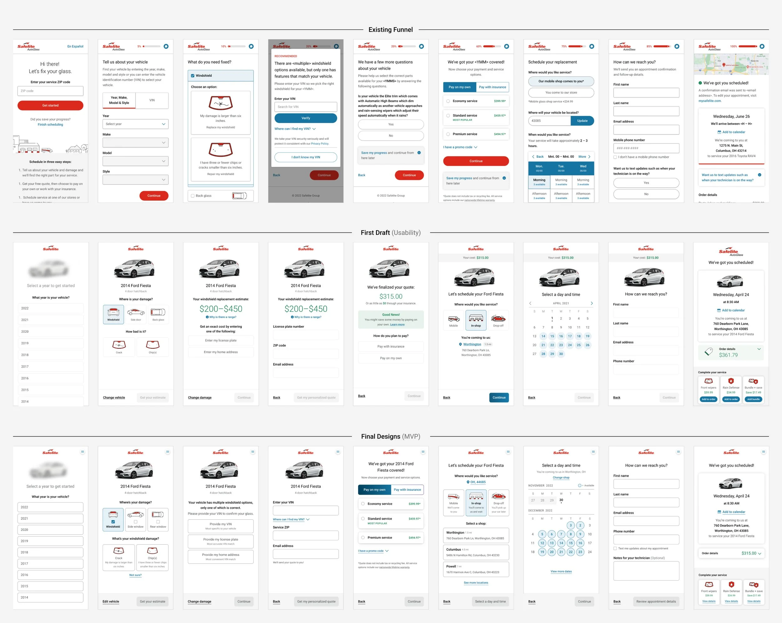
First row: Existing site designs
Second row: Initial redesigns for research
Third row: MVP designs
What impact does our prototype have on funnel performance?
Method:
Unmoderated usability
Sample size:
40 per test
Problem statement
Before spending too much time and energy on the redesign, we wanted to test quickly and early to make sure we were headed in the right direction. To understand this, we created a prototype of our redesign up to the Quote page, which accounts for roughly half of the funnel.
There was an opportunity to learn how our Quick Quote (Test variation) performed against our existing funnel (Control variation) to see if we were already making improvements or if we needed to go back to the drawing board.
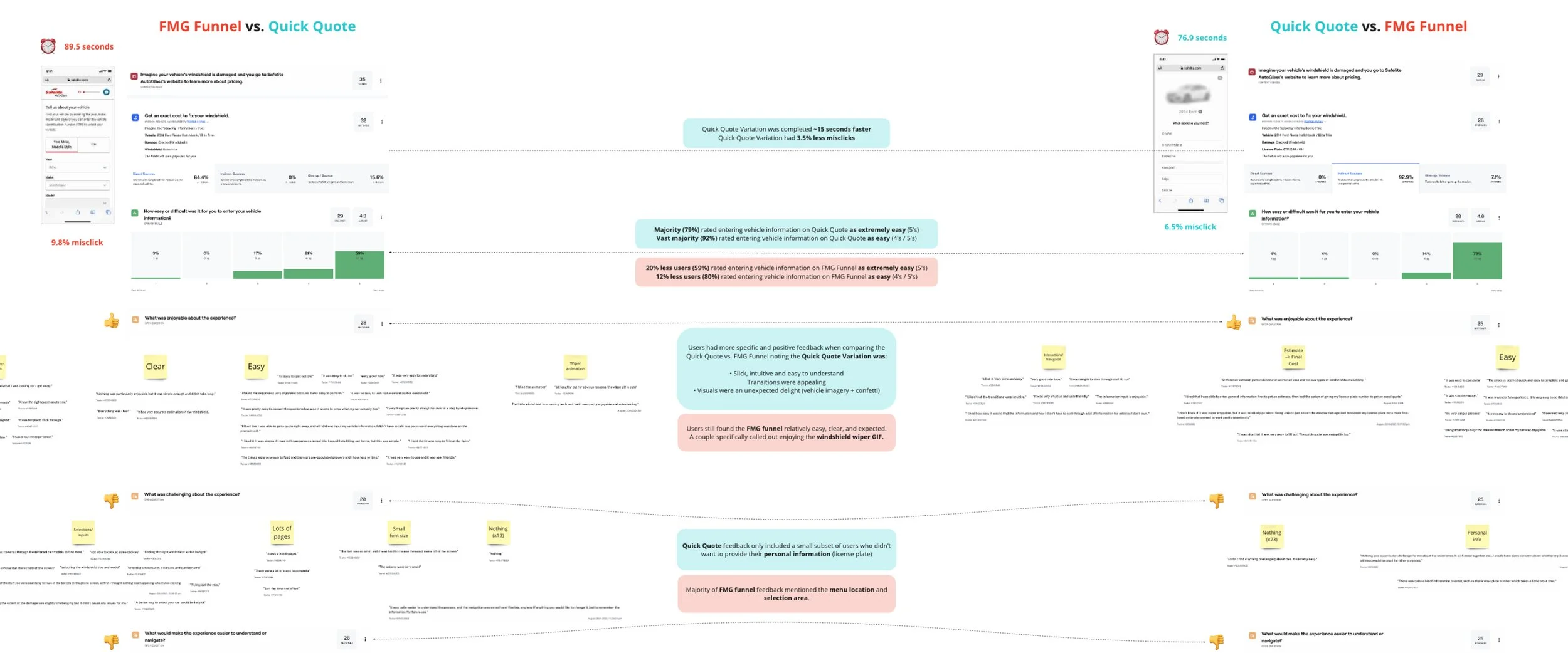
Analysis of usability results in Miro
Findings
The test experience was completed 11 seconds faster than Control (~78s vs. ~88s)
Majority (74%) rated the Test experience as the easiest to navigate
Majority (68%) rated the Test experience as feeling the quickest
Majority (72%) rated the Test experience as their favorite overall experience
Recommendations
Finish designing the full funnel and create a more advanced prototype in preparation for more in-depth moderated usability testing.
What pain points or areas of friction require priority attention?
Method:
1:1 Moderated usability
Sample size:
10
Length:
1 hour
Problem statement
After designing each page of the funnel, we developed a Framer prototype that allowed users to interact with real buttons, inputs, and logic during testing. This prototype offered a more realistic experience compared to our previous Figma prototype, which relied on a simplified click-and-proceed interaction.
In order to obtain thorough insights into the completely redesigned funnel experience, we opted for moderated usability sessions. Our objective was to evaluate how customers perceived individual screens and the overall user journey.
There was an opportunity to pinpoint significant pain points and determine which areas required prioritized enhancements.

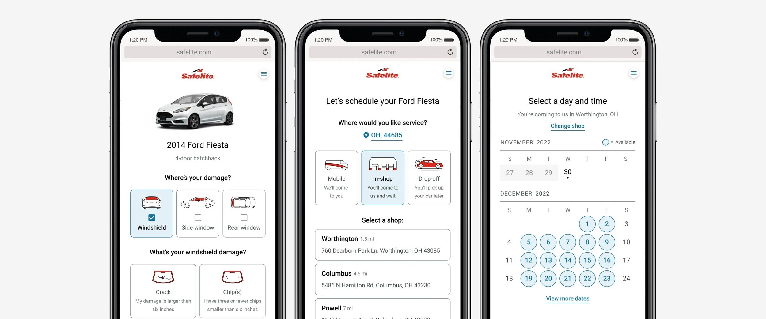
On the left, a screenshot of one of our moderated usability sessions
On the right, our Miro board of interview notes and insights
A handful of different screens tested in usability
Findings
Additional guidance could be provided to users
Example: What is the difference between a crack and chip? How can we help them make the right choice and increase their confidence?
Example: What is the difference between Mobile, In-shop, and Drop-off? How can we make sure they pick the best option for their schedule?
Users still didn’t understand why their vehicle year, make, and model wasn’t enough information, even though the estimated range did encourage VIN entry
Shop selection wasn’t immediately clear, and users struggled going back and forth between the calendar and location page when trying to find better availability at a different location
The vehicle visual was an unexpected delight, however, some users mentioned the incorrect color of their vehicle caused confusion
Users showed indifference to the confetti animation shown when a finalized quote was at the lower end of their estimated range
Recommendations
Add supporting copy to important decision points to help guide and inform
Include explanations for the “why” when asking users to perform an inconvenient task (VIN collection)
Remove unnecessary or extravagant visuals and keep it simple
Simplify the scheduling experience through improved shop location selection and calendar navigation
How can we reduce complexity in the scheduling experience?
Method:
Unmoderated usability
Sample size:
40 per test
Problem statement
After conducting moderated usability sessions, our team identified several areas that needed improvement. Among these, the most substantial area of concern centered around the Service Location and Schedule page.
This sequence not only proved to be the most complicated for our users, involving tasks like selecting a convenient day, finding available times, and navigating between shops with varying schedules, but it also presented considerable challenges for our development team.
The need to fetch data from our database to display relevant shop options and times quickly added its own set of complexities. As such, this demanded close teamwork and multiple rounds of iterative design and testing.
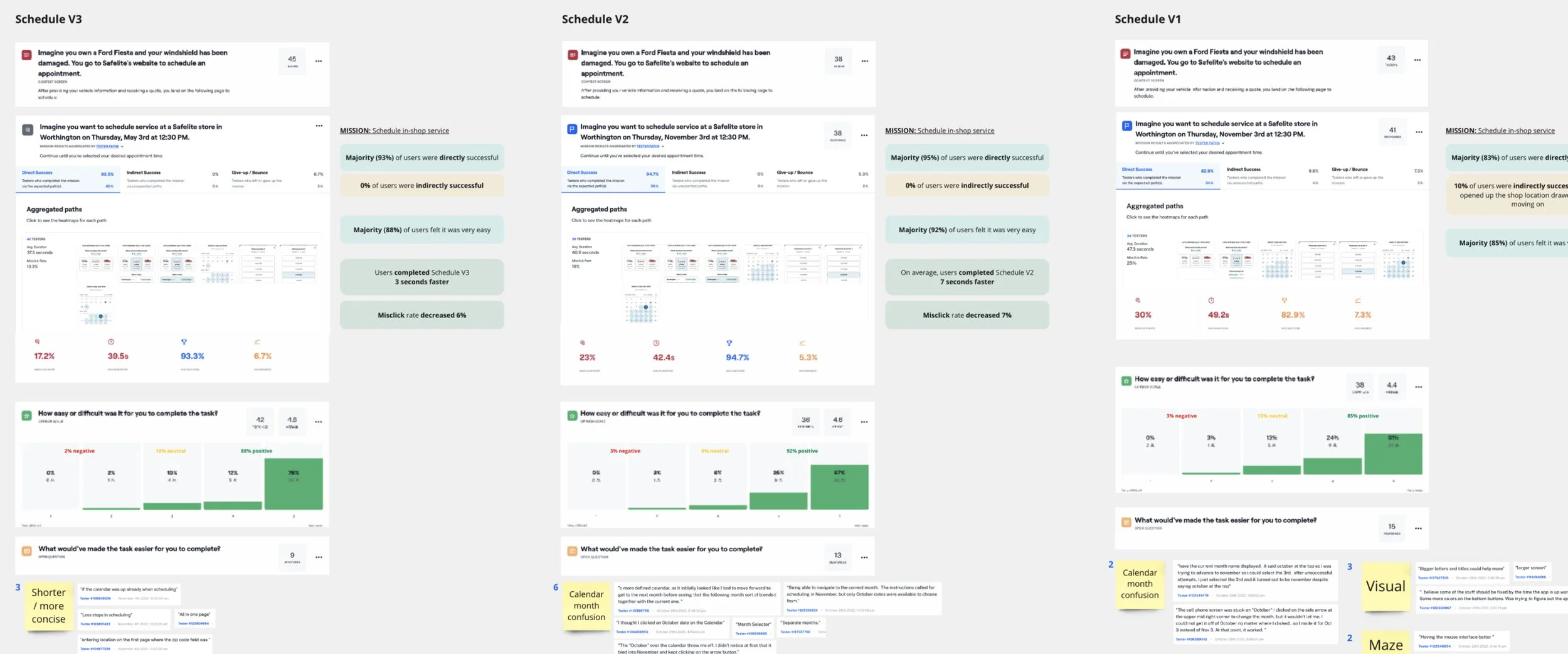
Miro board of analysis and insights, comparing results across our tests
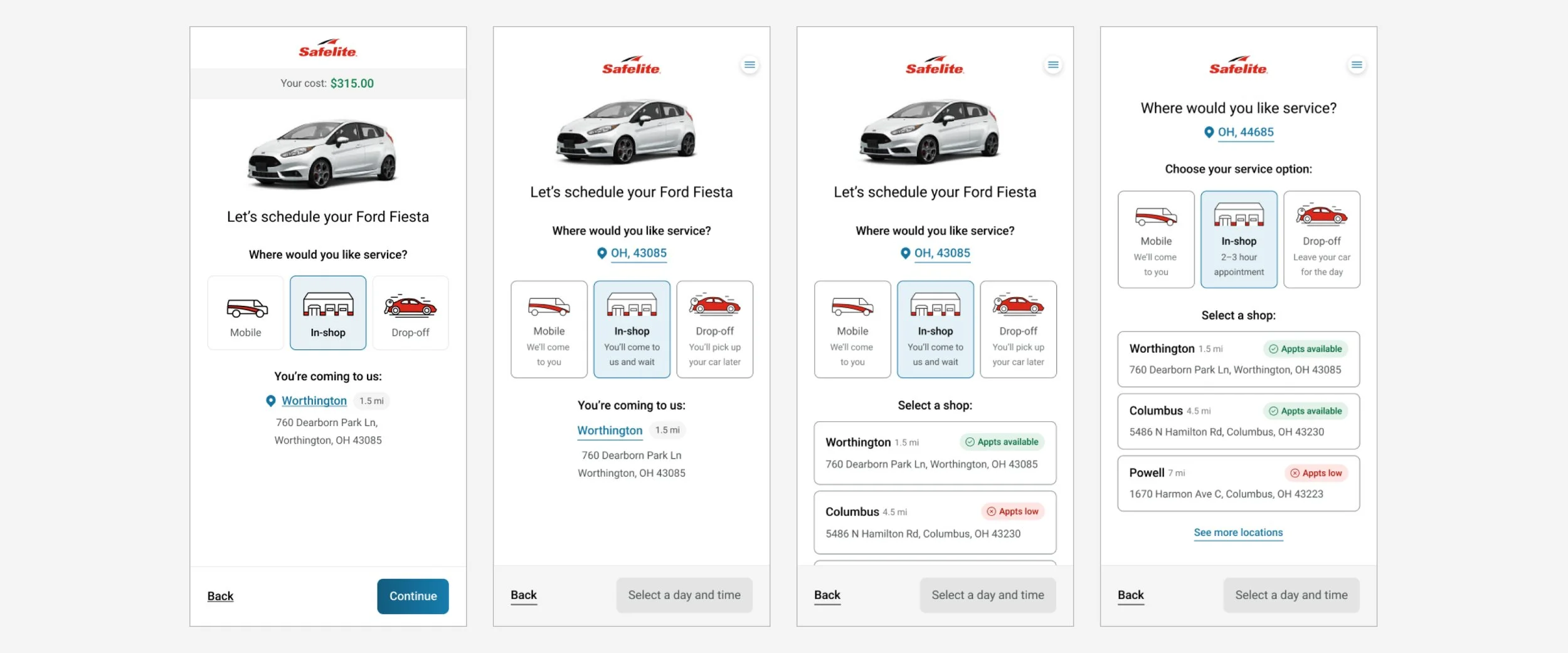
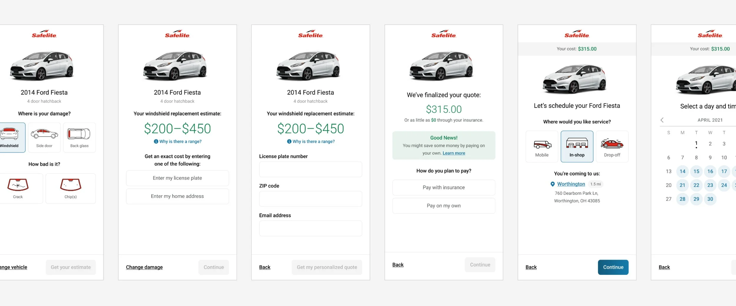
Iterations of the Service Location page, each design including updates from unmoderated usability learnings
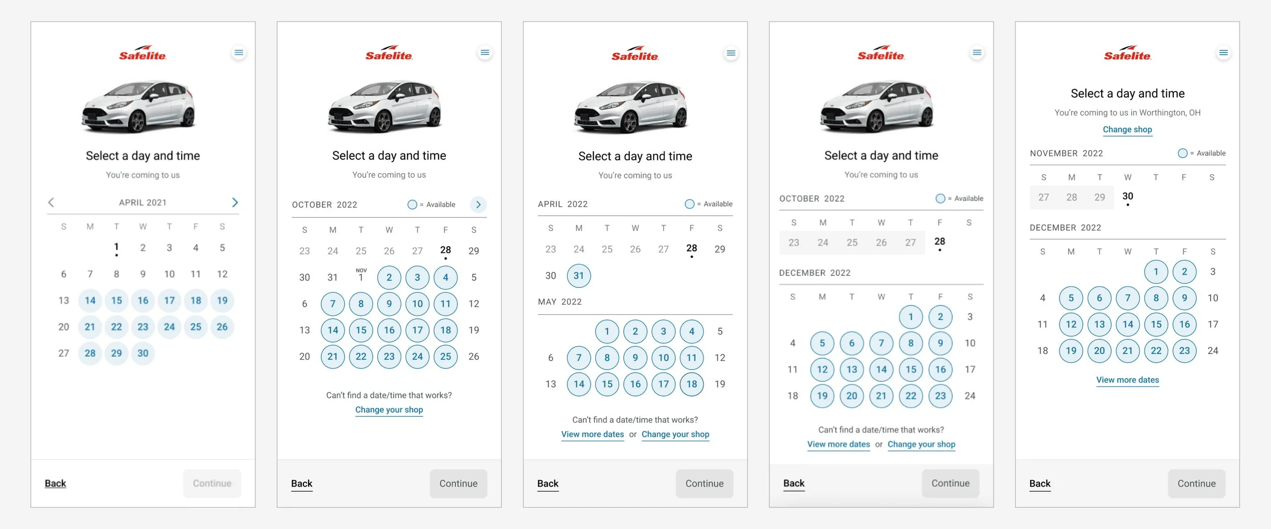
Iterations of the Schedule page, each design including updates from unmoderated usability learnings
Findings
The final experience performed significantly stronger than the Control(s):
Completed 21 seconds faster
13% reduction in misclicks
26% increase in reported ease
No complaints about calendar confusion
What drove the above results:
The rolling calendar efficiently saves space by displaying the current week on the first line. However, in earlier versions, users often missed the month change until we fully separated it in future iterations.
In earlier versions, users eventually managed to change their shop location, however, we made a significant improvement by automatically displaying the top 2-3 closest locations directly on the page, removing the need for an additional click.
We improved the descriptions below each service location option to provide greater clarity on the differences between the choices. As a result, users were able to understand and more confidently select the option that best suited their needs.
Recommendations
Following MVP rollout, update the "Change shop" link on the Schedule page to display available shops in a drawer on that same page, instead of linking back to the previous page
Following MVP rollout, update the shop locations to include “Appts available” and “Appts low” tags to help set expectations on the number of appointments that will be available on the next screen
Impact
Given that this project involved a complete redesign and reconstruction of the existing funnel using a new framework, our implementation strategy deviated from the typical approach of previous A/B tests. We aimed to learn throughout the development process, so our team chose a phased approach.
After building each page, we created a partition where 5% of our customers could access the new funnel. These customers would use the new funnel up to the point of its current completion. Following, without their awareness, they would be redirected back to our old funnel to complete the remaining steps in the experience.
By adopting this approach, we were able to gather data and insights during the development process and introduce only a minor inconsistency for a portion of our users. Additionally, the insights we gained from these launched pages informed new enhancements for the team to work on, all while allowing the development team to continue building the remaining funnel.

Final MVP screens
Team
Lead Designer & Researcher: Me 👩💻
Product Manager: Lindsay Stout
UX Writer: Laura Lampe
Development Lead: Mark Harris
Front-End Lead: Bryan Mauger
Data Analyst: Jesse Weber
UX Director: Jordan Monson
Product Director: Tim Simeone