Trillium Wind Logo
Project Overview
Trillium Winds needed an identity that could represent a five-member ensemble while drawing from the trillium flower, a naturally three-petal form. The challenge was to create a system that felt unified and balanced, while giving each musician and instrument equal presence.
The solution centers on a refined mark that allows the trillium to coexist with five distinct elements without feeling forced. A consistent visual language ties the system together, while subtle variations ensure each instrument is represented with equal weight. The result is a cohesive identity that reflects both the group’s unity and the individuality of its members.
My role:
Freelance designer
Client:
Trillium Wind Quintet
Project scope:
Logo design
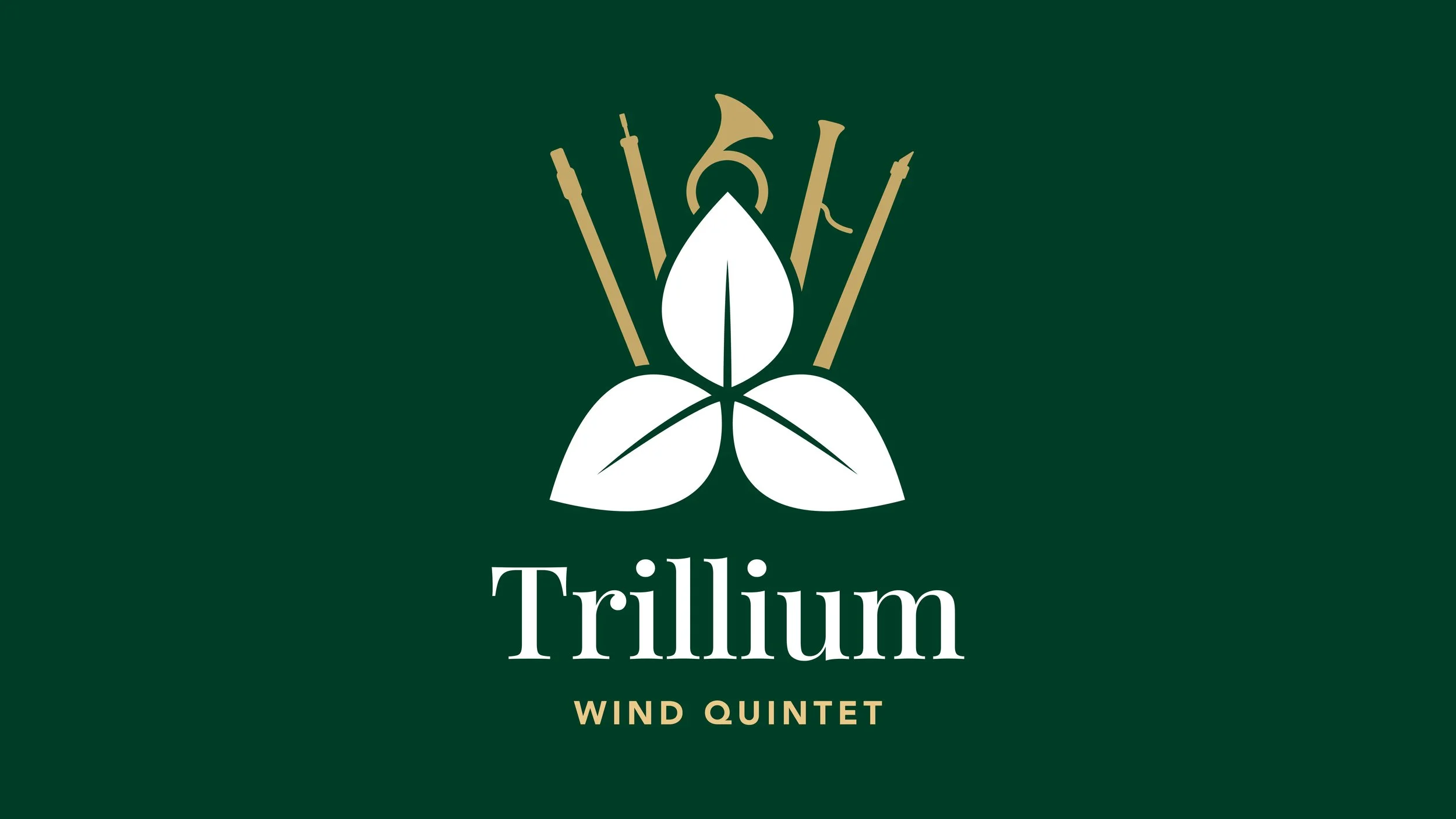
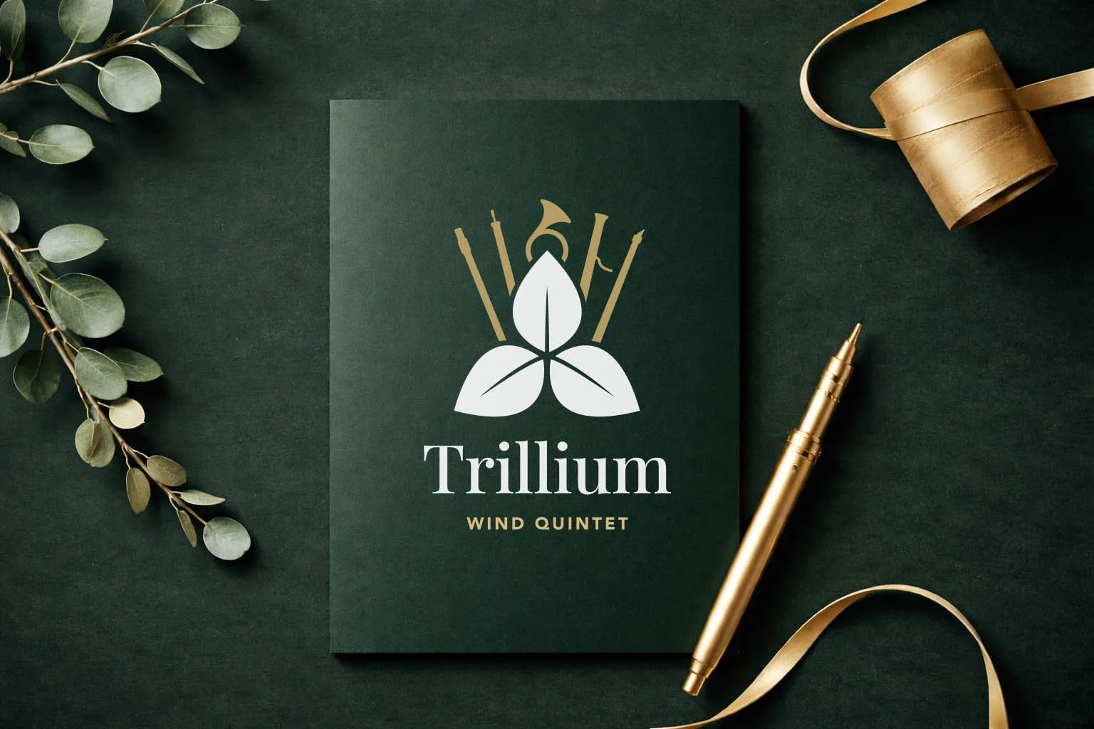
Final mark blending nature and music
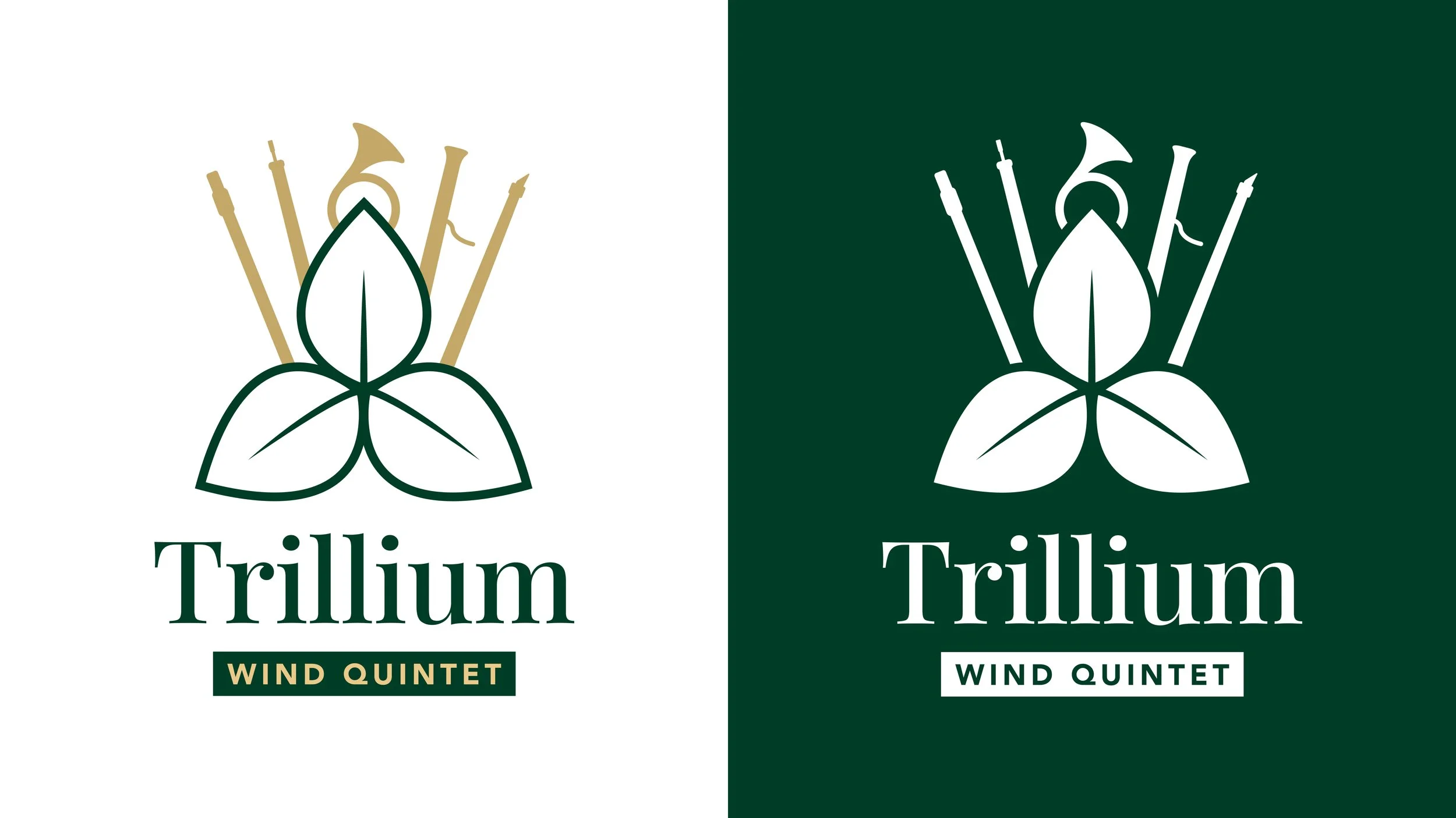
Flexible, high-contrast logo applications
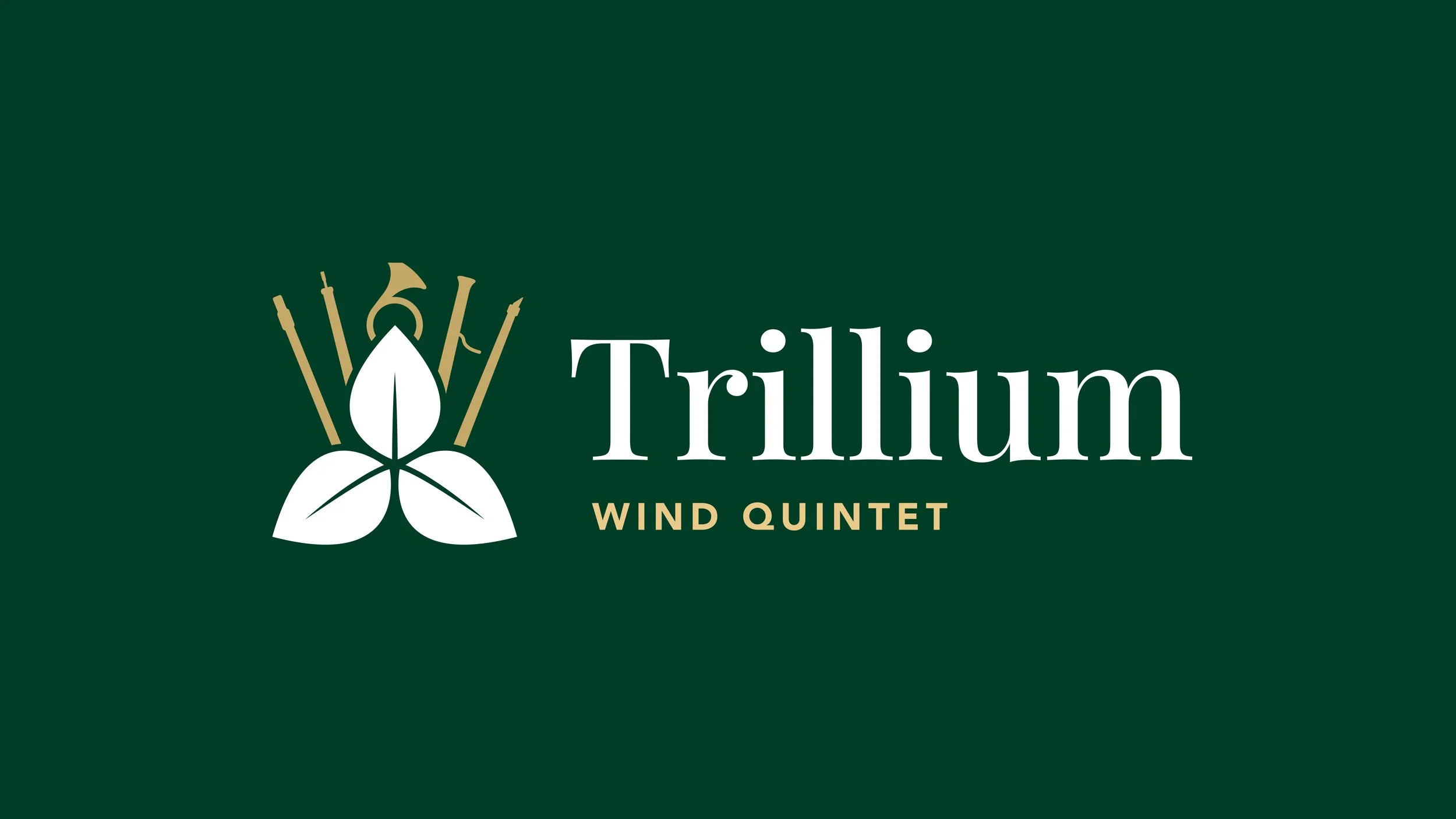
Secondary, horizontal logo lockup
Print mock-up showcasing the brand in use
Alternate Explorations
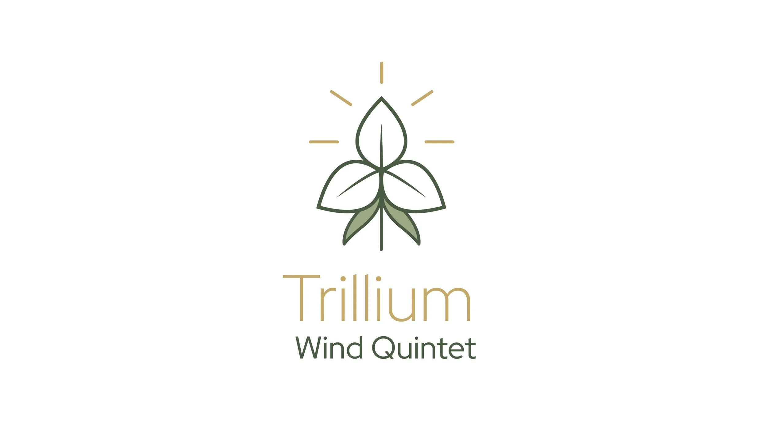
Alternate 1:
A modern, stylized trillium flower, accented by five lines radiating outward to represent the five voices of the wind quintet.
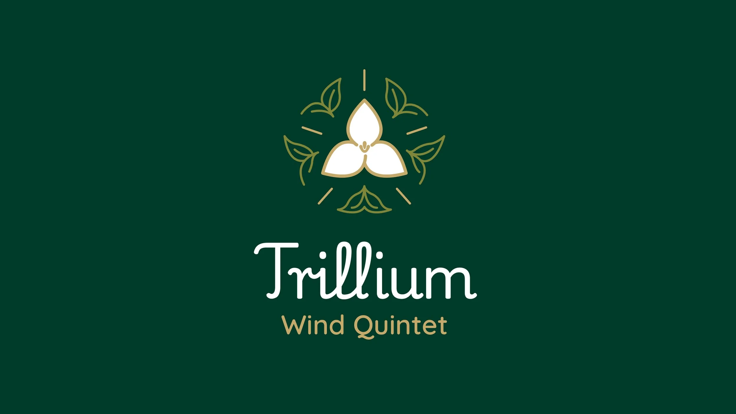
Alternate 2:
An emblem-style design with a trillium at the center, framed by five leaves and five radiating lines to represent the five voices of the quintet.
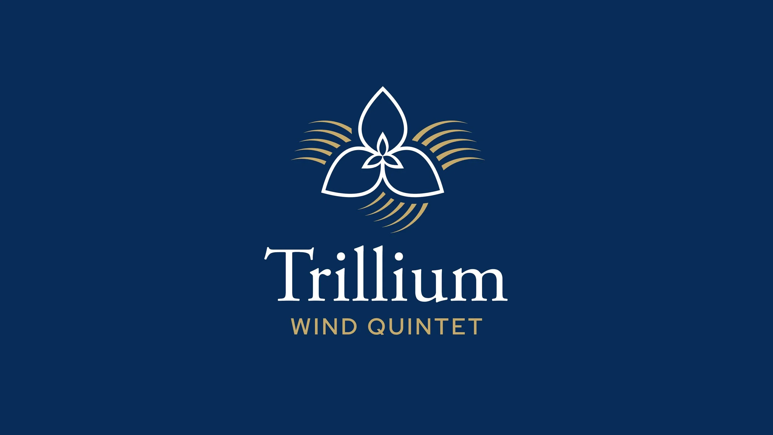
Alternate 3:
Five flowing lines ripple out like music, each one echoing a voice from the quintet, joining together to shape a trillium flower.